 A few weeks ago I wrote about changes in Instagram’s algorithm, now I’ll show you the platform changes LinkedIn implemented earlier this year.
Your New LinkedIn Home Page
Does LinkedIn’s New Homepage look familiar to you?
The 3-column home page layout is similar to Facebook, albeit with some differences on what each column contains.
Because of the multiple LinkedIn updates, the first column of your home page now shows a thumbnail profile picture, including a snippet of your preview image. It also shows your professional headline, the number of your connections and recent profile views.
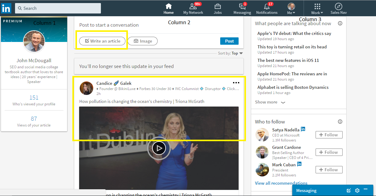
At the middle column is your feed, where you can see what other people have posted recently. It’s also where you can share an update, photo, or post an article.

The ‘post an article’ feature is a direct link to LinkedIn’s publishing platform, so you can write and publish a whole article directly from your home page. This new layout might confuse some people, especially those who haven’t tried the platform’s publisher feature.
Then below the post button is the news feed, which looks similar to the old platform.
The third column includes LinkedIn’s recommendation of people to follow.
Me Section: Everything about You in One Centralized Page

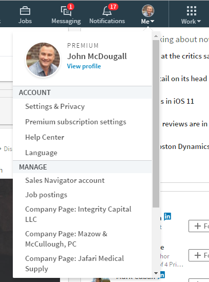
Now let’s explore the “Me” section, previously called the profile section. Click the “view profile” link to edit and view your profile. You’ll also see the privacy, language settings, the company pages you manage, and help center, if you click the dropdown arrow.
This is what you’ll see if you click on your profile link. Notice that the background and photo image have different size specifications, and your profile photo is now circular. As per LinkedIn’s guidelines, the new specifications are:
- Profile photo: between 400 X 400 pixels, and 20,000 X 20,000 pixels
- Background photo: 1584 X 396 pixels
You can add new profile sections by clicking the dropdown arrow on the top right hand side of the screen, and you can edit your website and contact information on the right side of the screen as well.
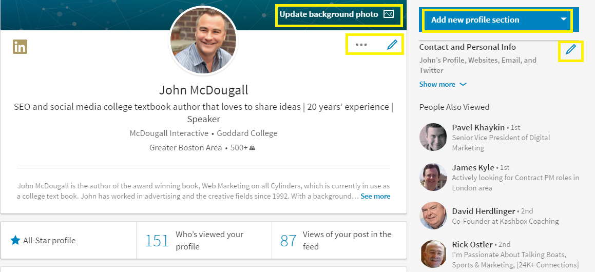
Clicking the pencil beside your picture allows you to edit your profile introduction, which includes your headline, current position, education, and location.
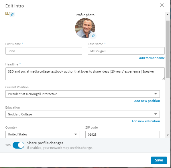
If you scroll down further, you’ll see the rest of your LinkedIn profile and it’s similar to the old platform.
LinkedIn’s New Search Function

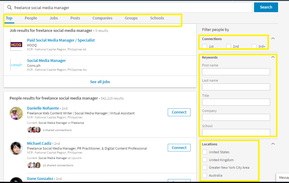
This set of LinkedIn updates also came with an entirely revamped search function. It’s now prominently displayed at the top of the home page. Like Facebook’s search functions, the search results are organized into people, companies, groups, and posts, with the addition of categories unique to LinkedIn, such as jobs, companies, and schools.
You can narrow your search even further by using the different filters available:
- Connections
- Keywords: first name, last name, company, school, title, location, profile language, and non-profit interests.
LinkedIn Updates for “My Network”
A lot has changed in the “My Network” part of LinkedIn. The old platform gave users the option to:
- See their connections
- Invites
- Add contacts via email or name
- Add “People You May Know”
- Add “Alumni” as connections
The new interface, on the other hand, only shows your invitations and “People You May Know.”
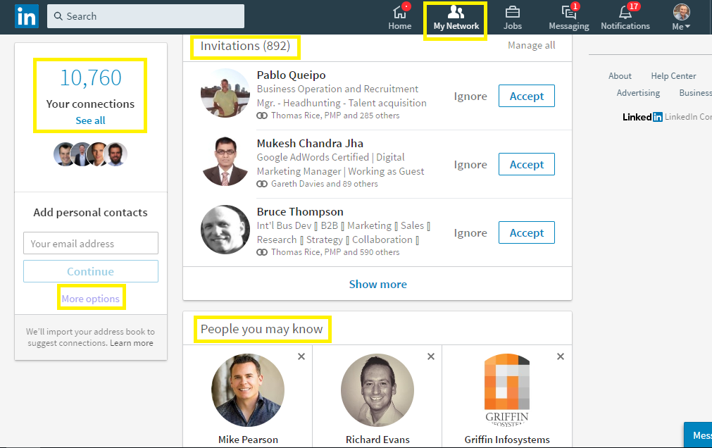
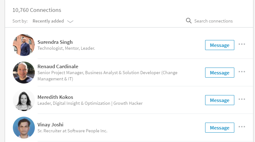
You’ll have to click on “See all” to get a list of your connections, and even then your only options are to send them a message or remove them as a connection. The option to sort connections by tags was removed, but you can still add new contacts using their email address at the left side of the page.
Now if you click the “more options” link from the My Network page, you can add new contacts by importing contacts from your email accounts.

Work or “More” Options
Now you might be wondering, where are all your groups and SlideShare presentations?
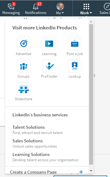
They’re now grouped under the “Work” section, along with these functions:
- LinkedIn Learning
- Advertising
- Post a job
- Lookup: LinkedIn’s way to different employees from one company
- Profinder: LinkedIn’s tool to help recruiters and small businesses find talent
- LinkedIn’s paid business services
- Create a company page
All Your Notifications in One Place
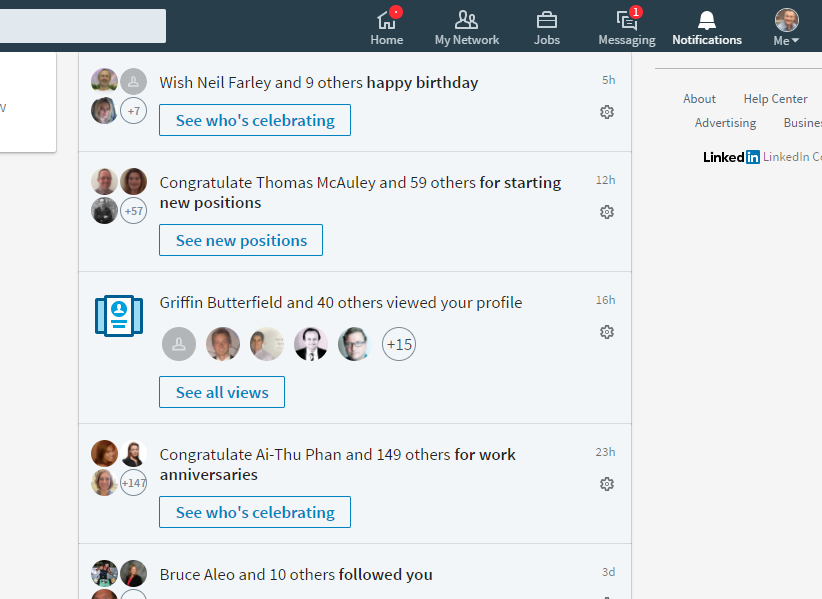
The notifications page is probably the best part of all these LinkedIn updates. Now it’s easier to read and respond to all your notifications, so you can easily build authority and up your engagement rate.
You no longer have to click on endorsements to see who endorsed you, and check individual groups and profiles to see who has a new job, or a new post.
Like Facebook, LinkedIn’s new notification platform gives you the option to engage with your connections directly from the feed. You don’t have to go to individual profiles to congratulate people on their work anniversaries, or say happy birthday.
A Better Feed
LinkedIn also updated their feed. They claim to have improved the feed with a combination of human editors and algorithm updates, so you only see posts from connections and publishers you’re interested in.
The algorithm changes might mean you have to change your strategy for building authority on the platform, or it may just means spammy posts are a thing of the past.
Did these LinkedIn Updates made the Website Better?
What do you think of LinkedIn’s interface changes? A lot of people complained about LinkedIn’s clunky user interface before, but now that it’s changed, some people aren’t happy either.
What do you think?
